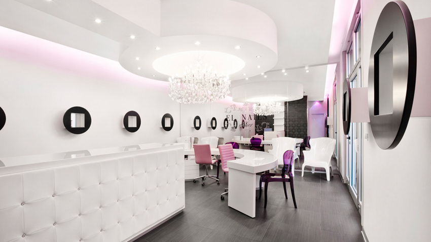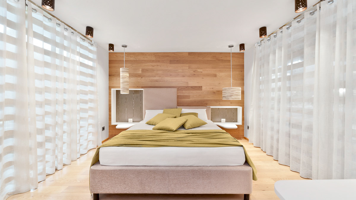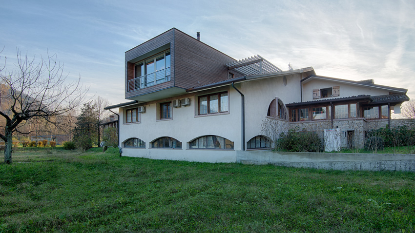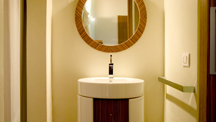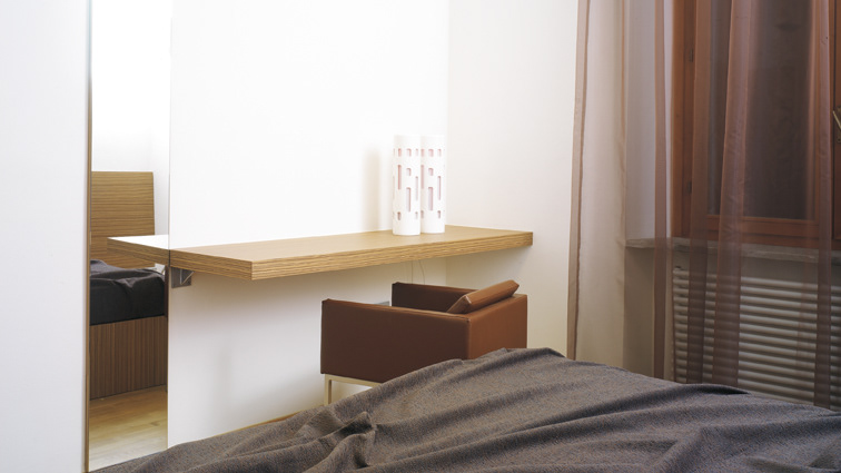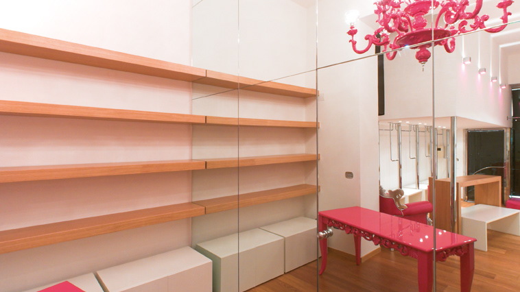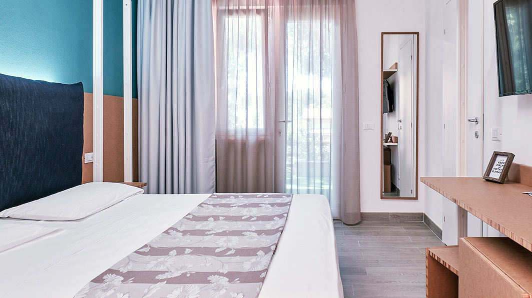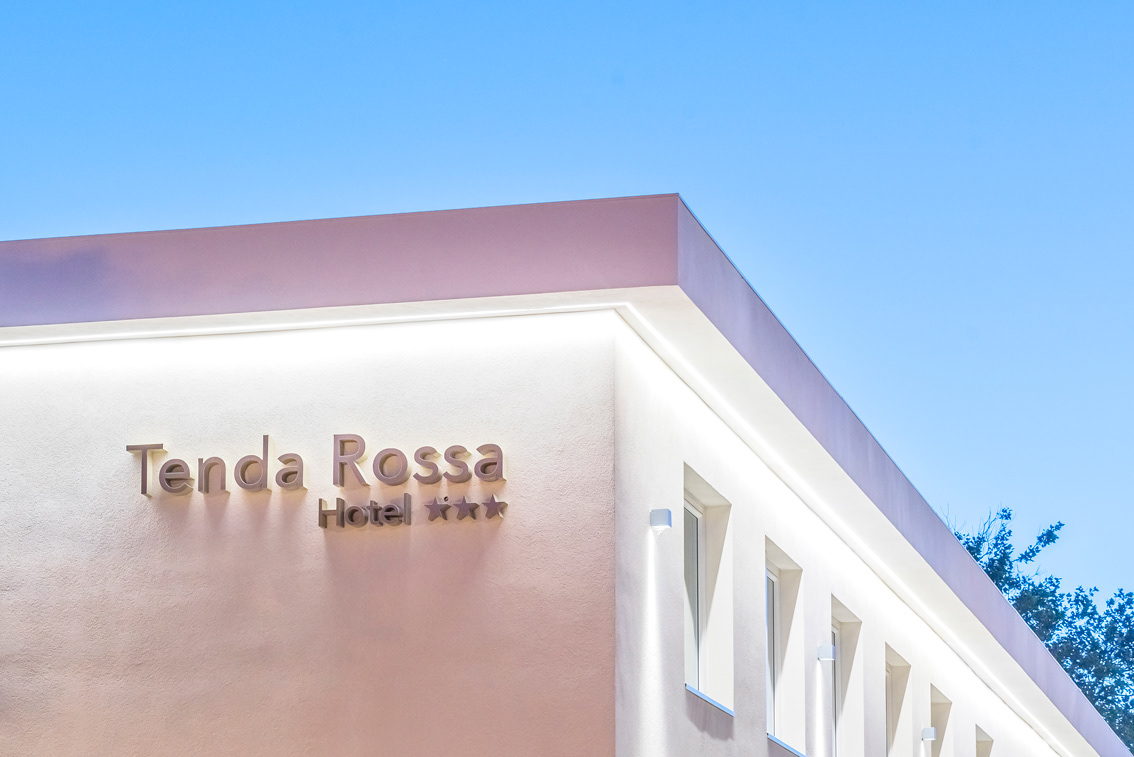
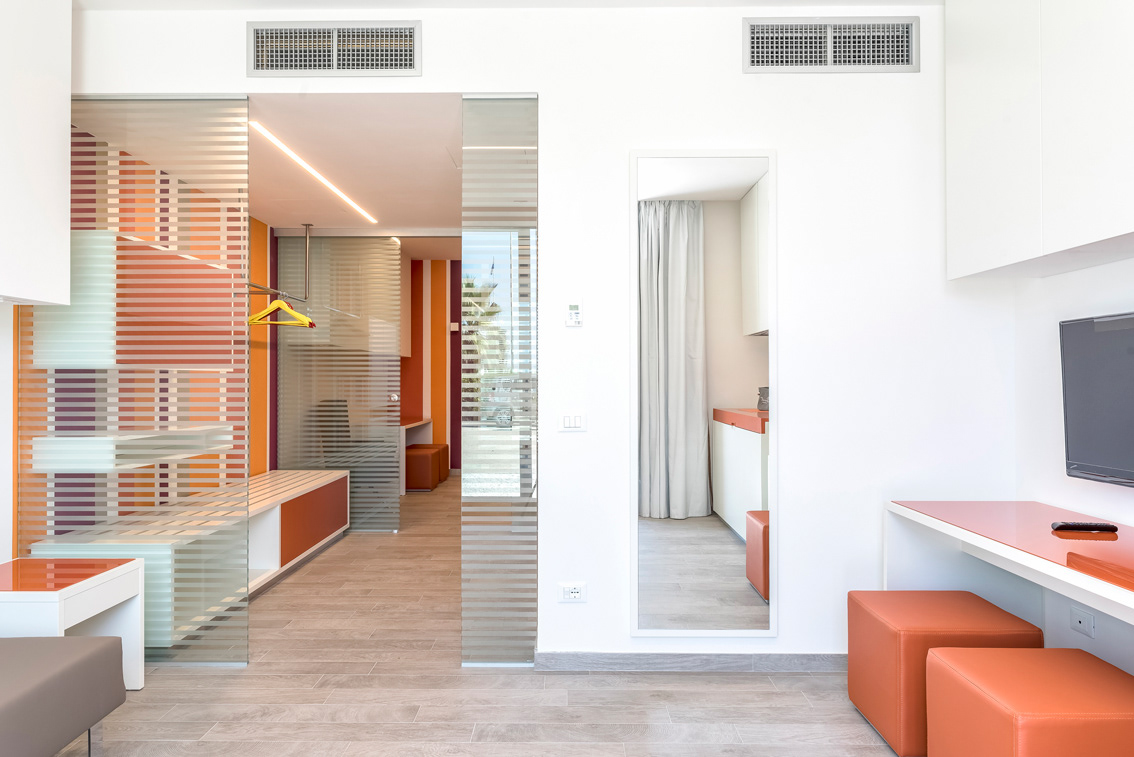
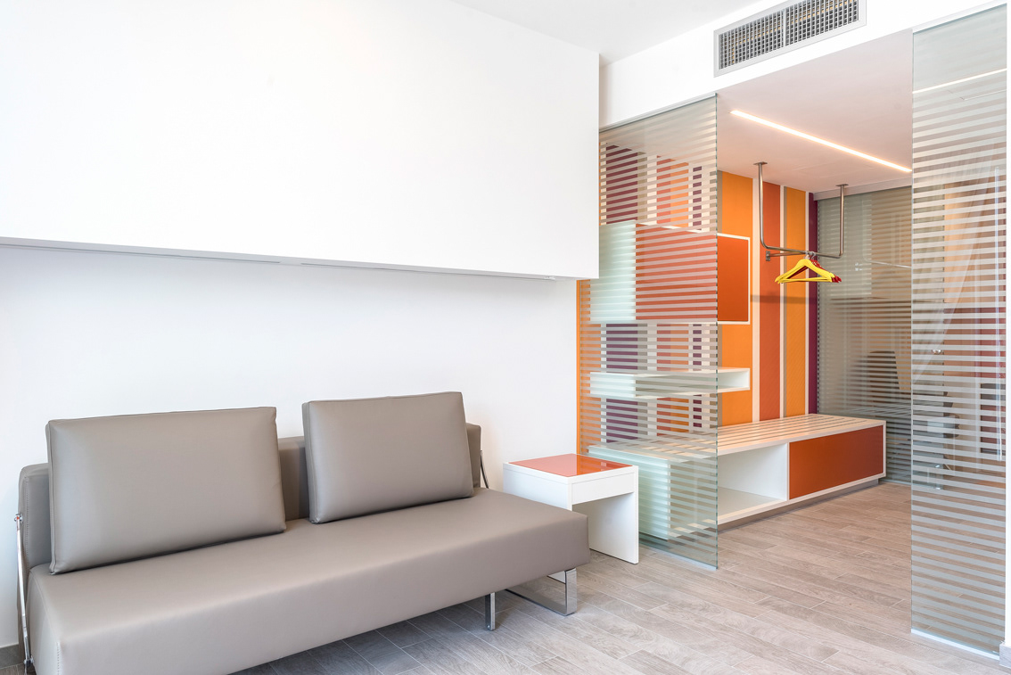
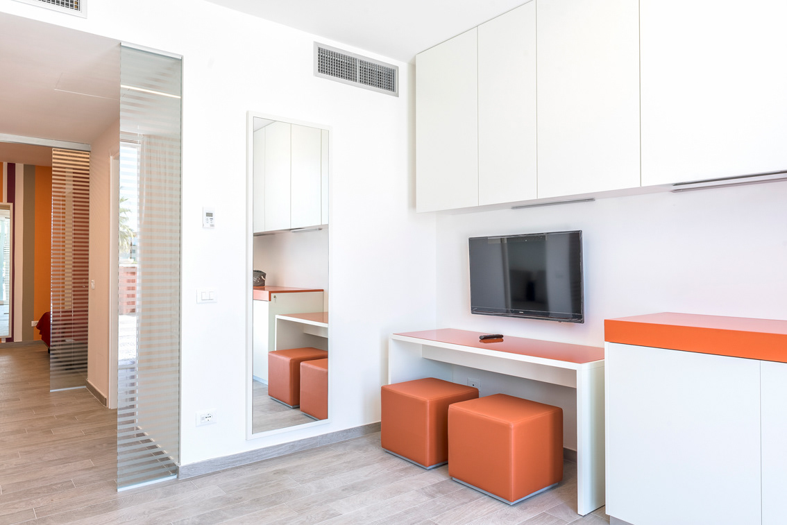
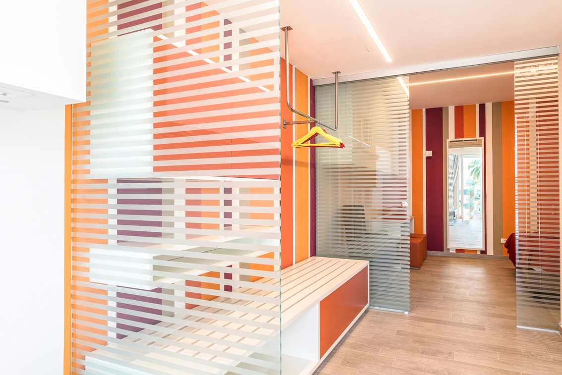
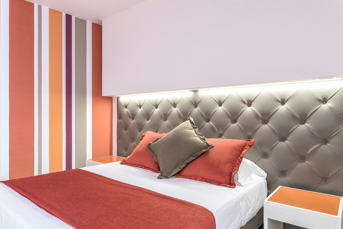
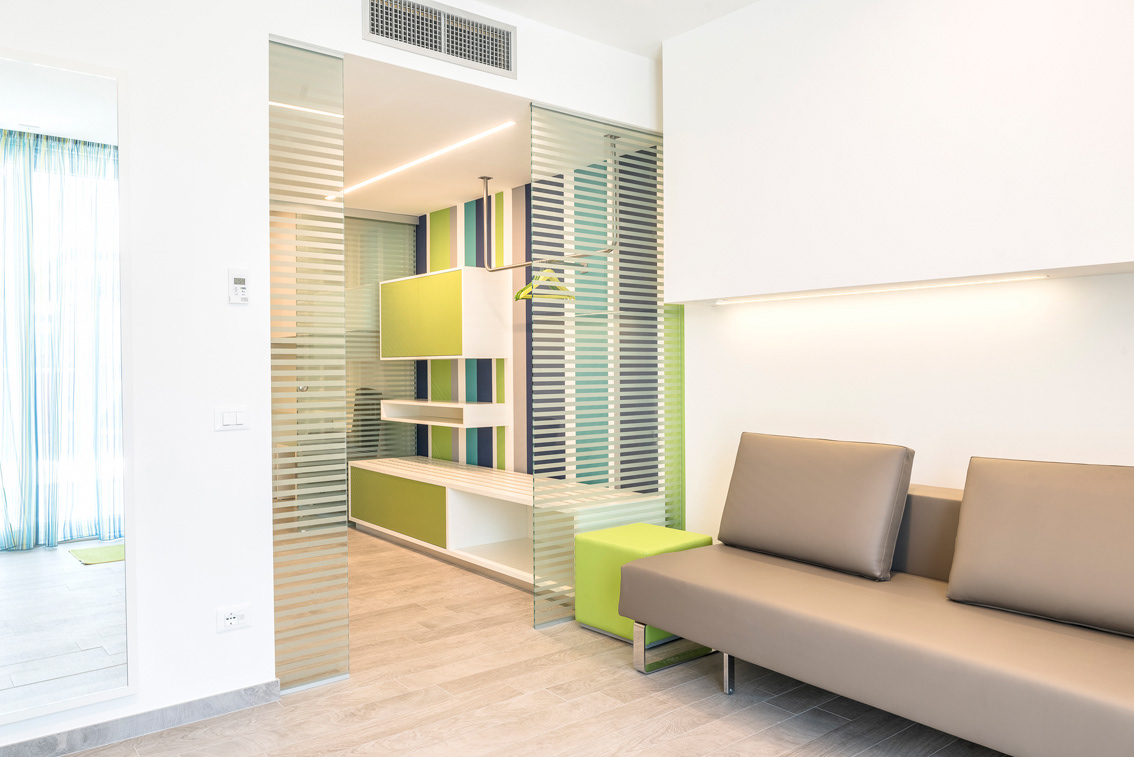
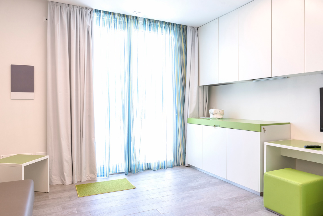
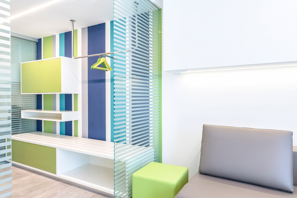
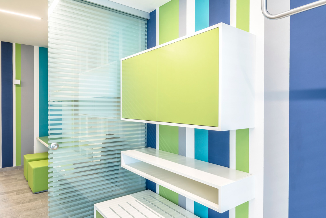
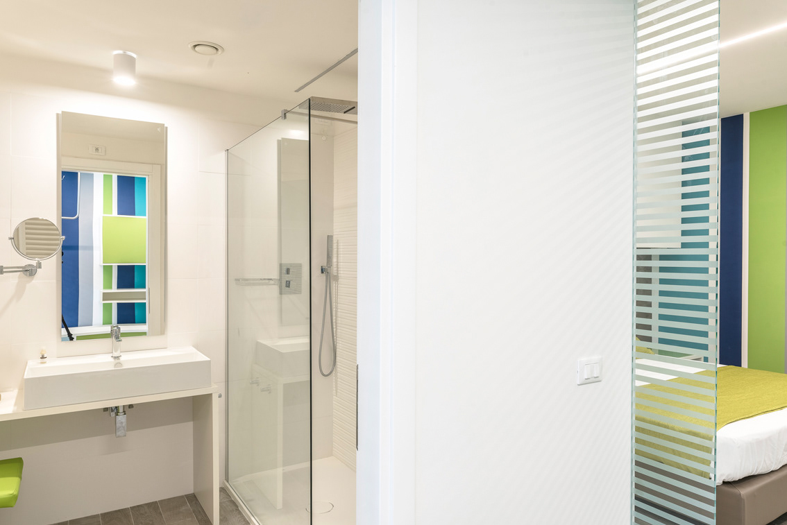
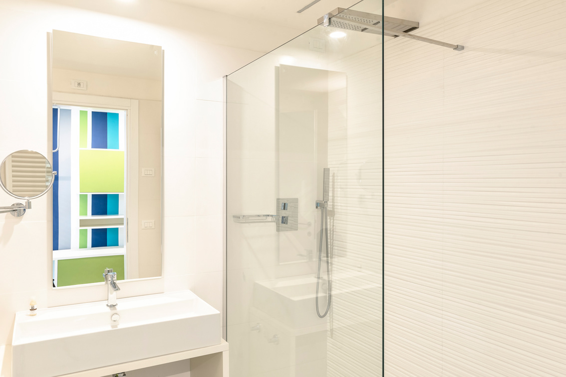

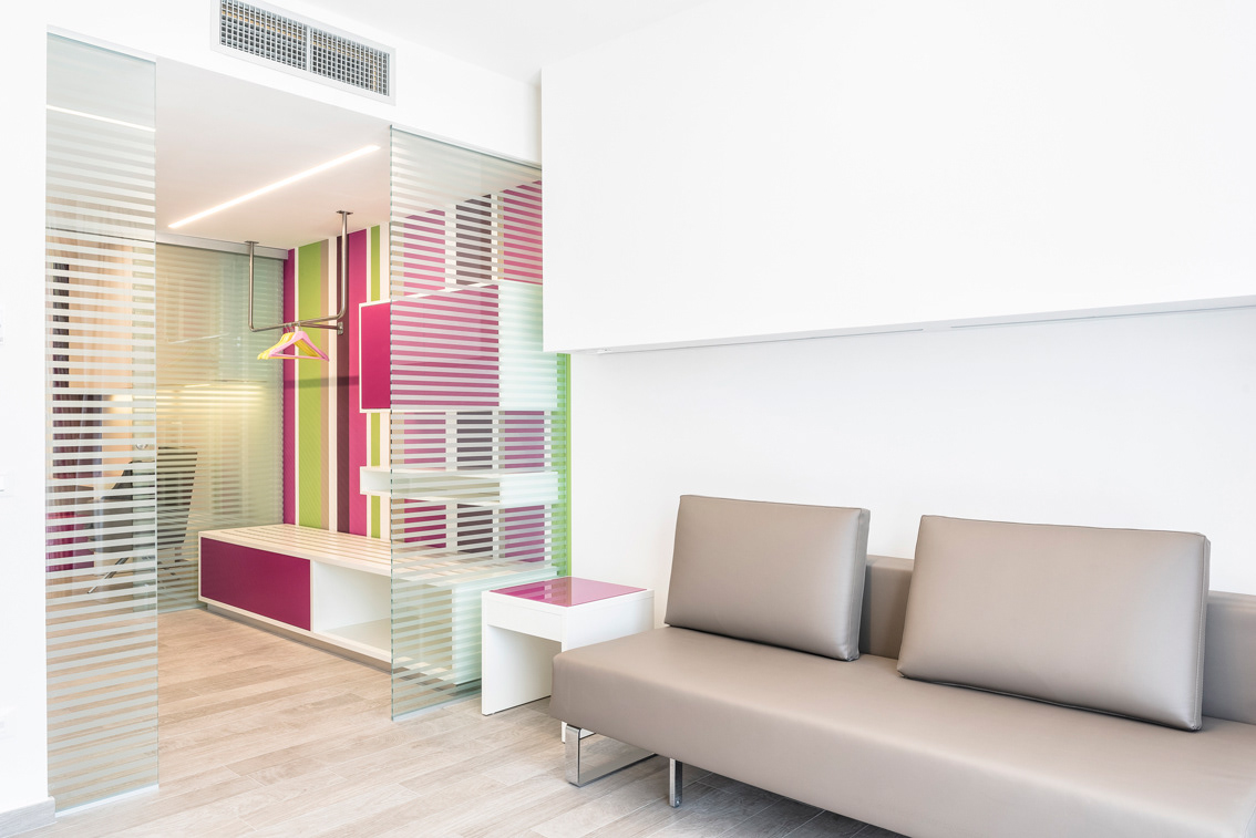
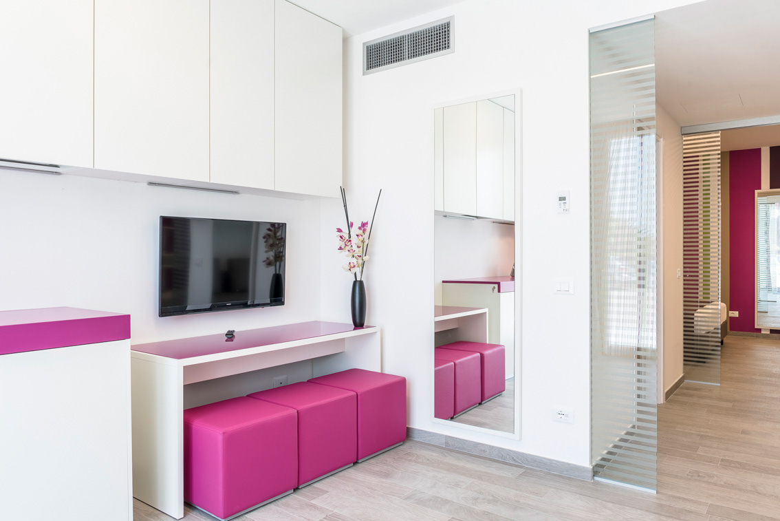
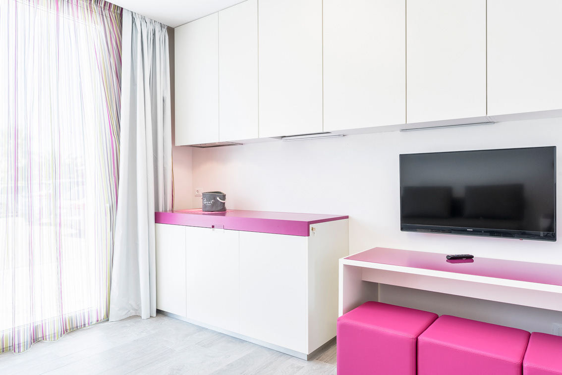
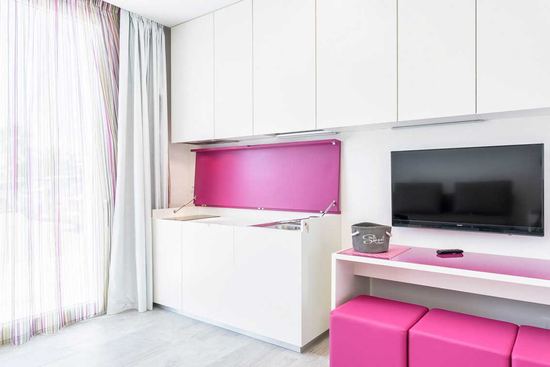
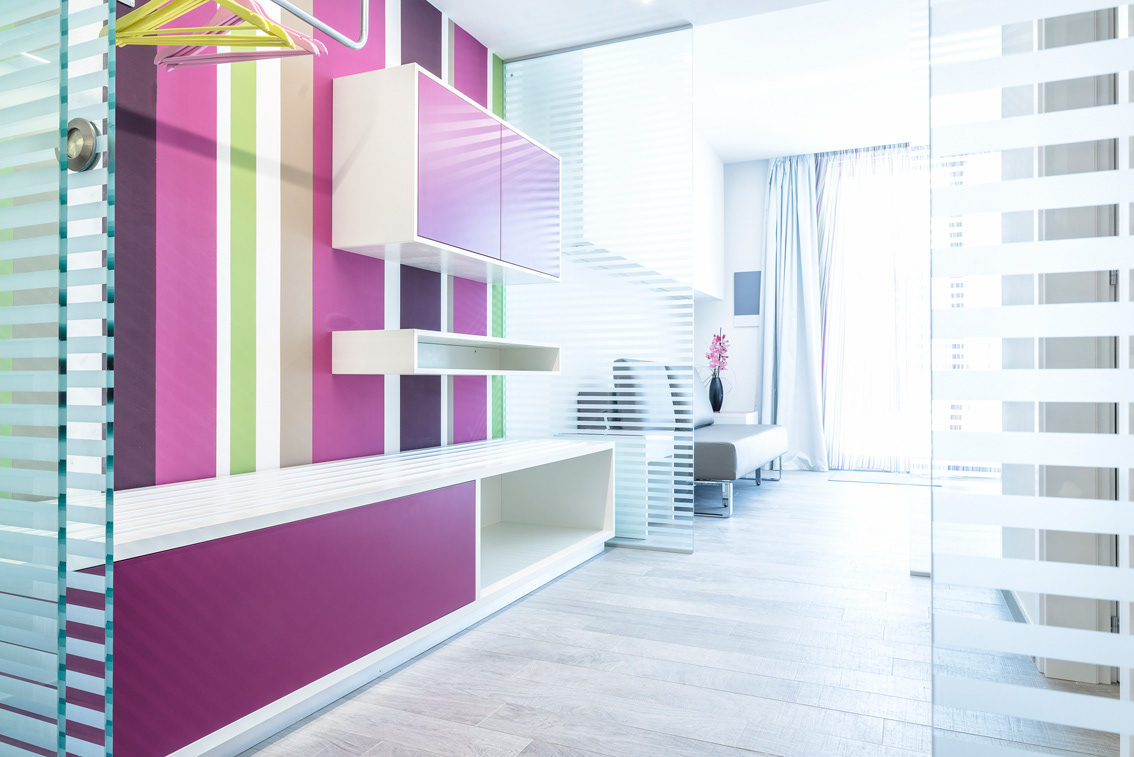
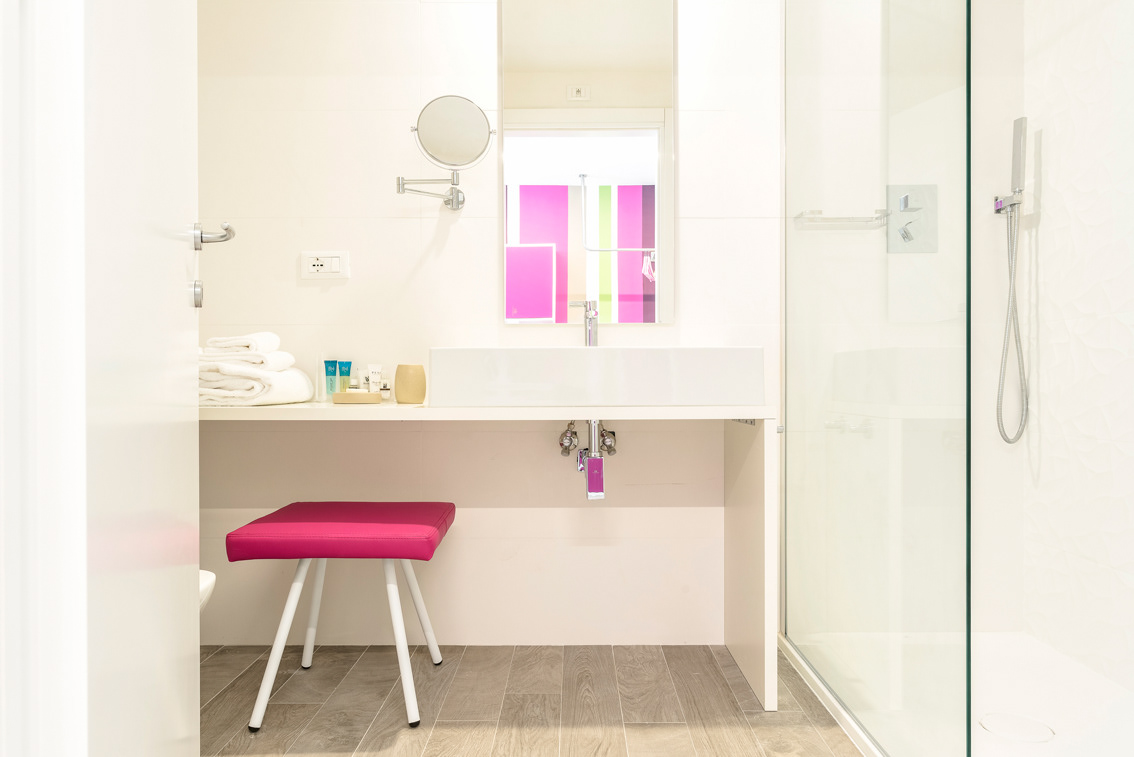
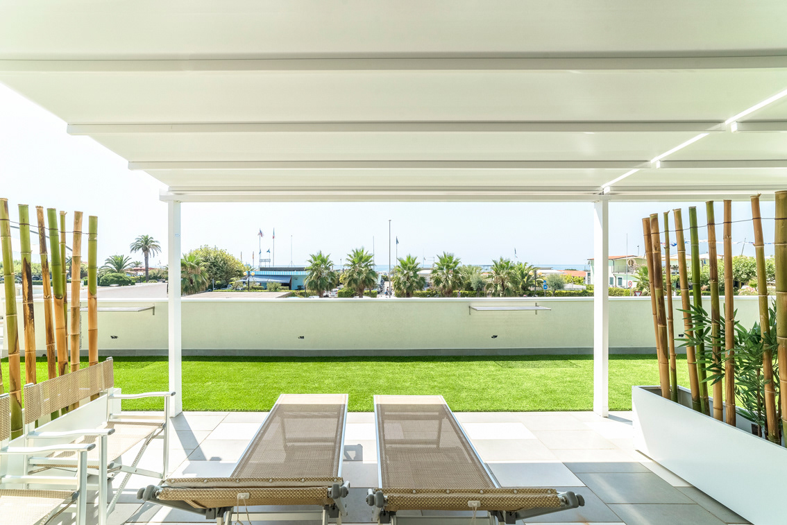
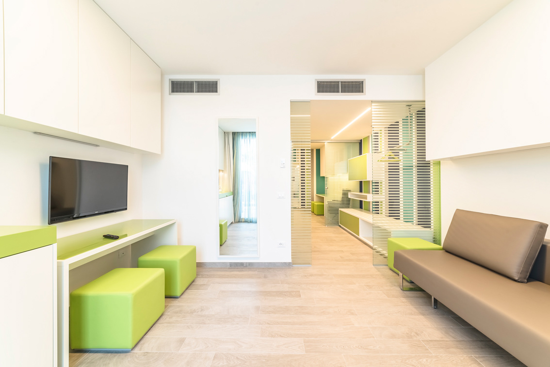
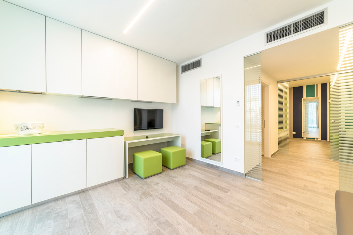
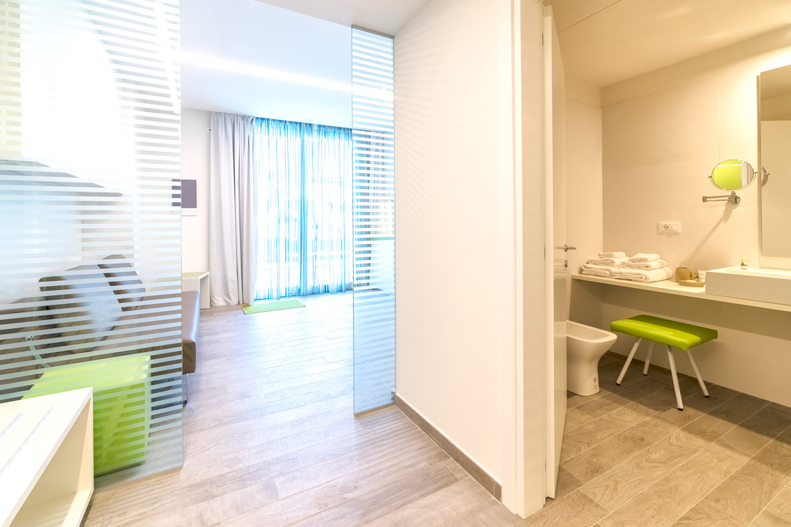
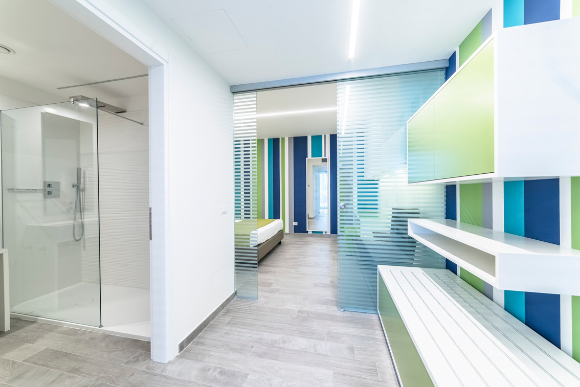
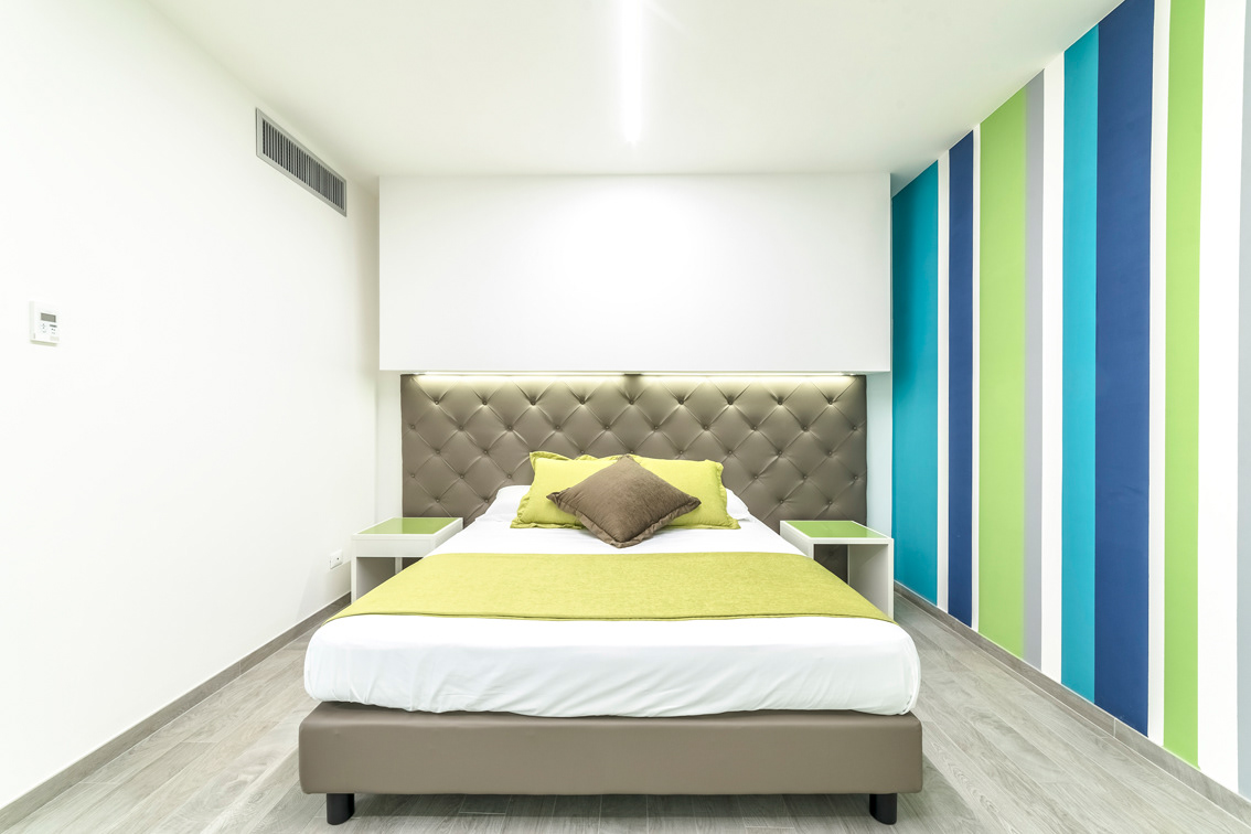
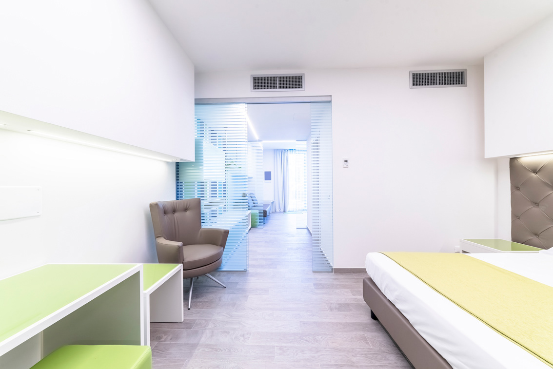
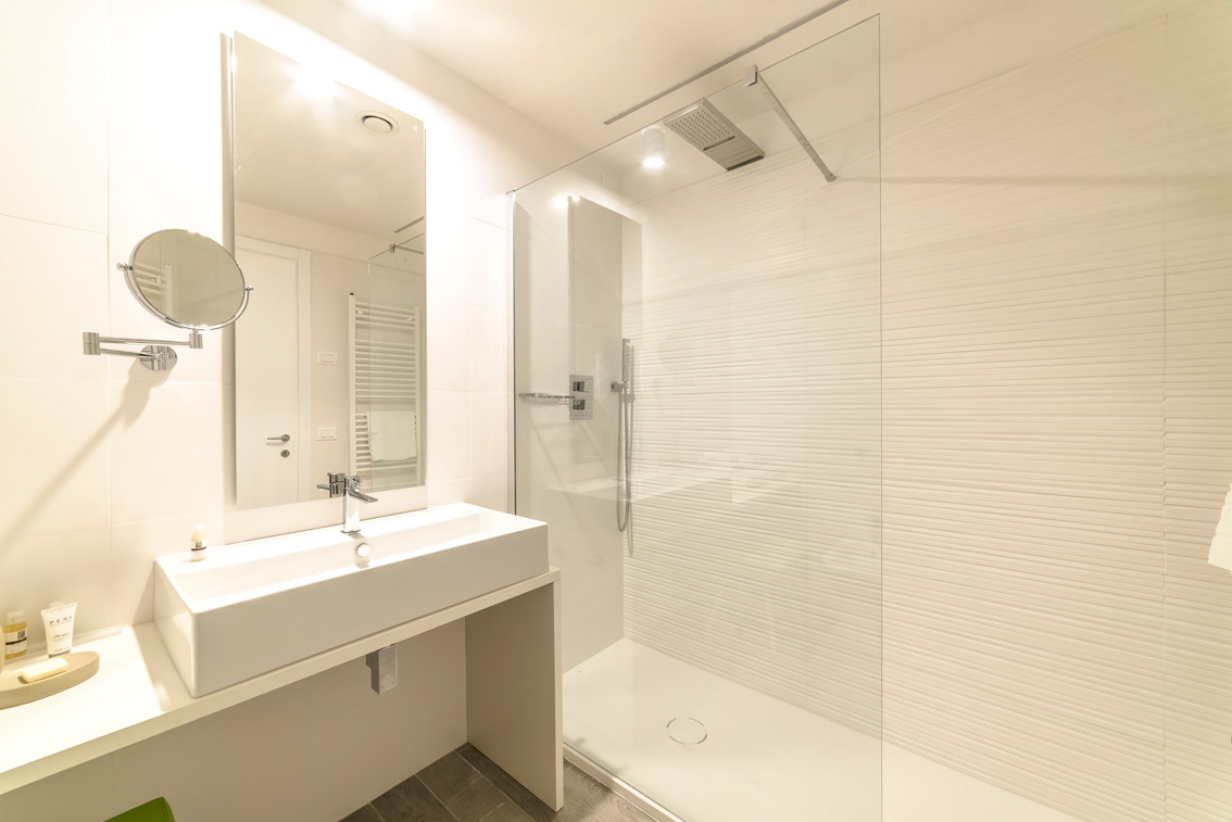
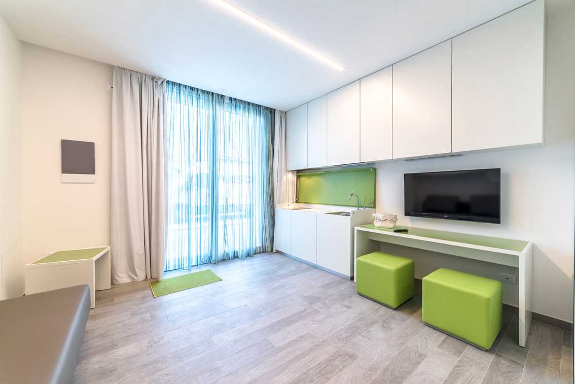
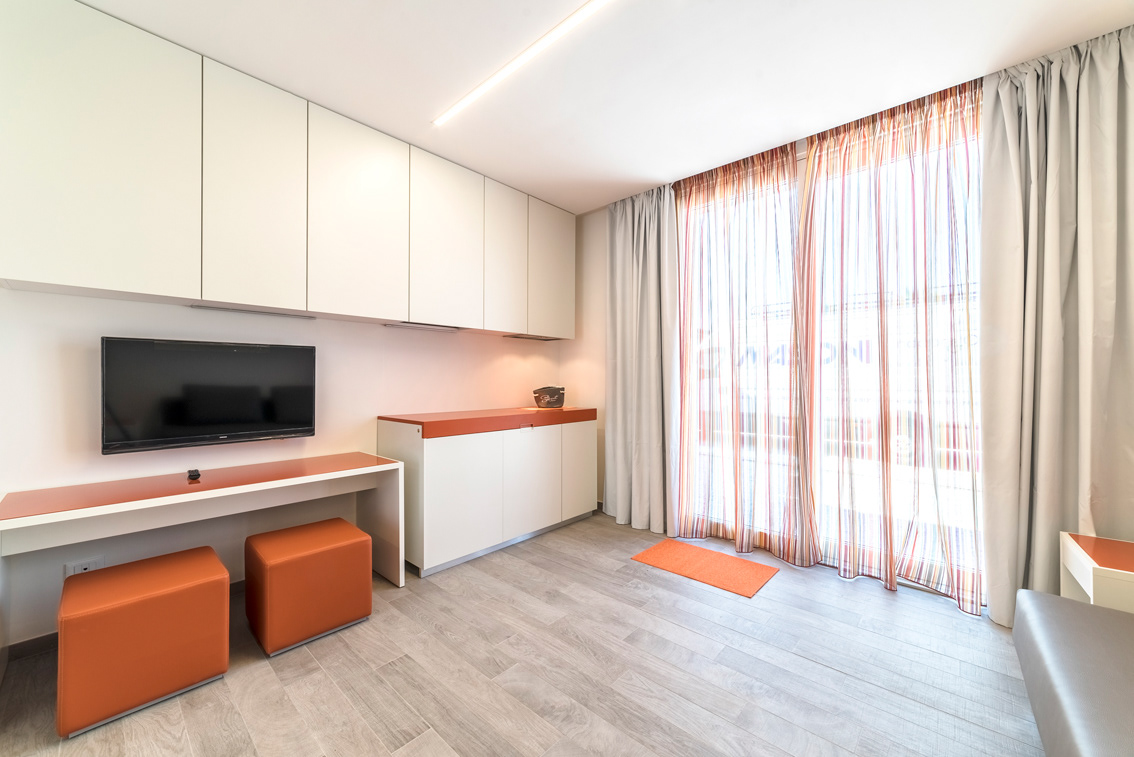
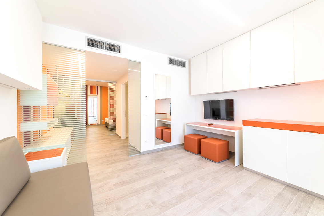
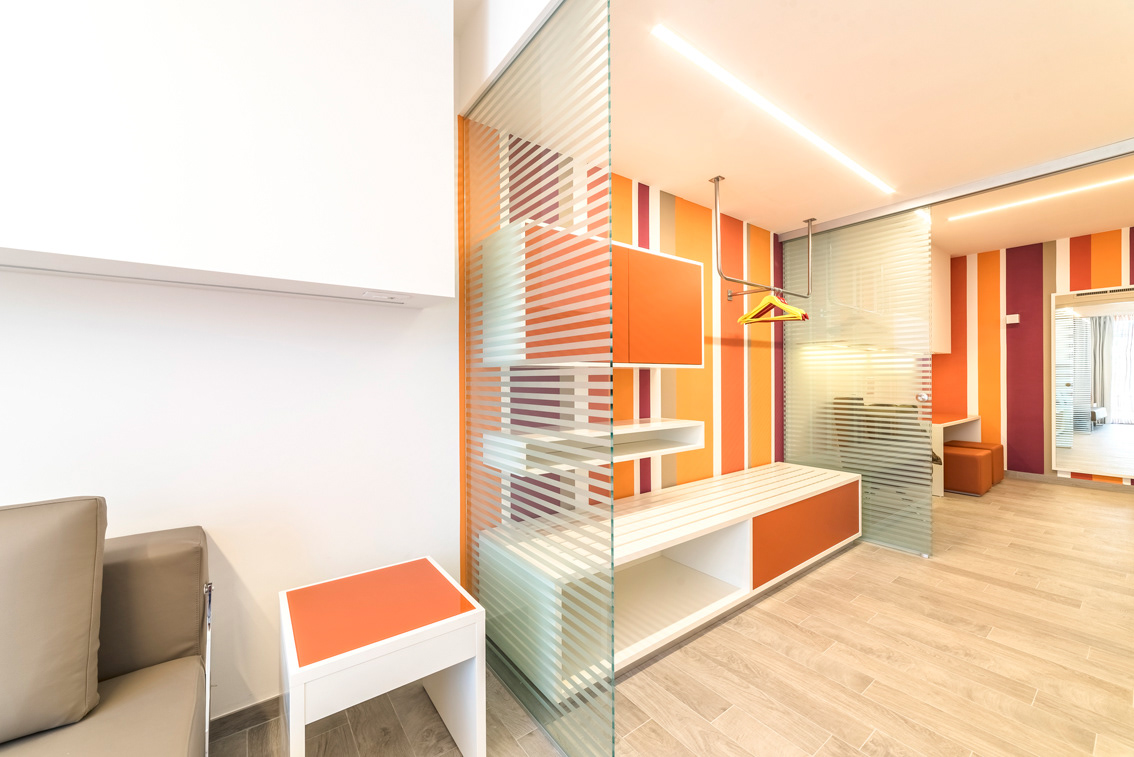
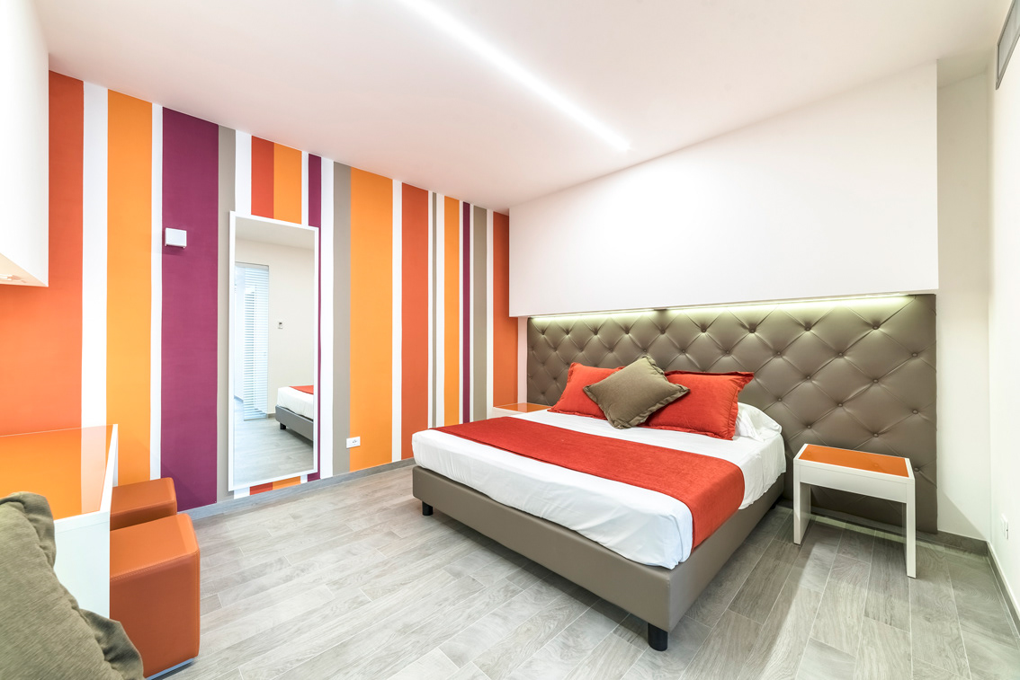
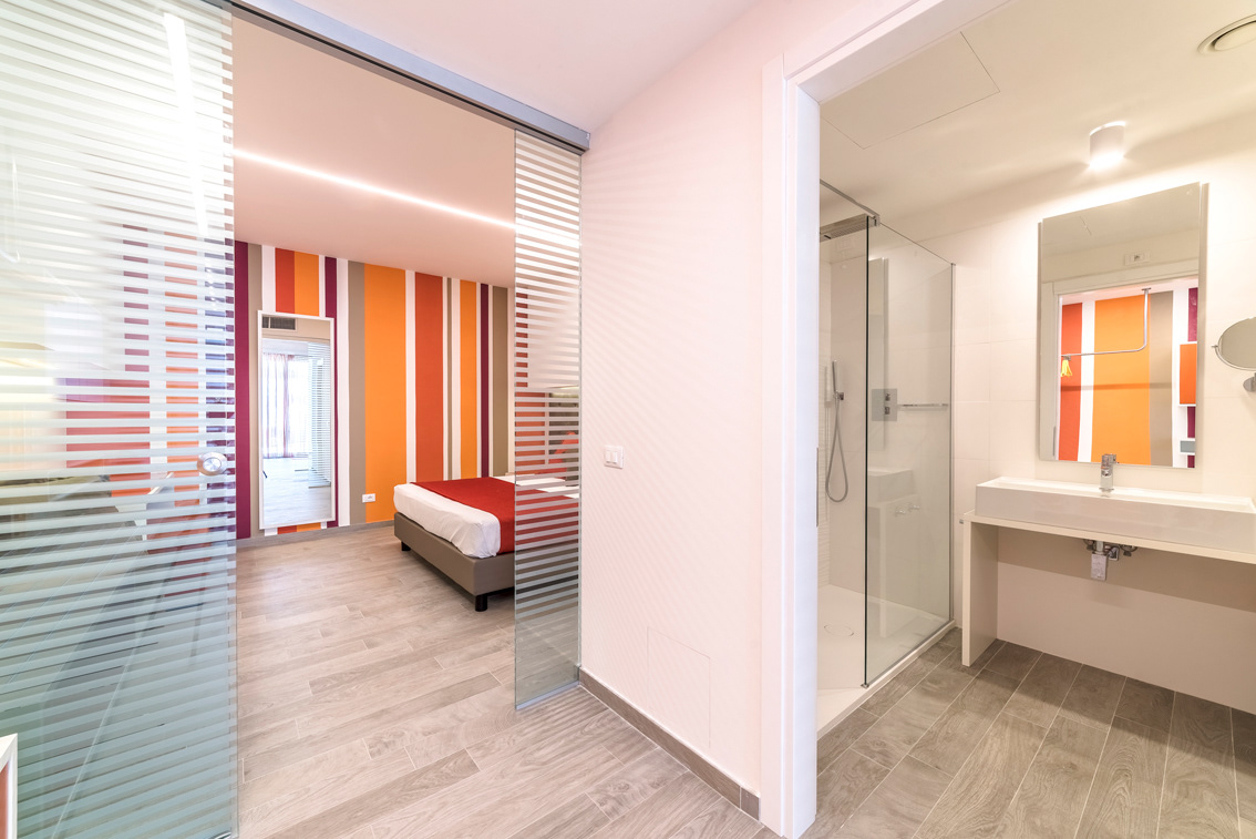

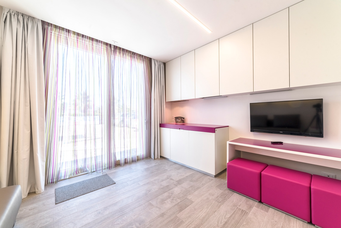
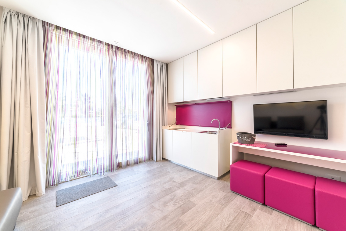
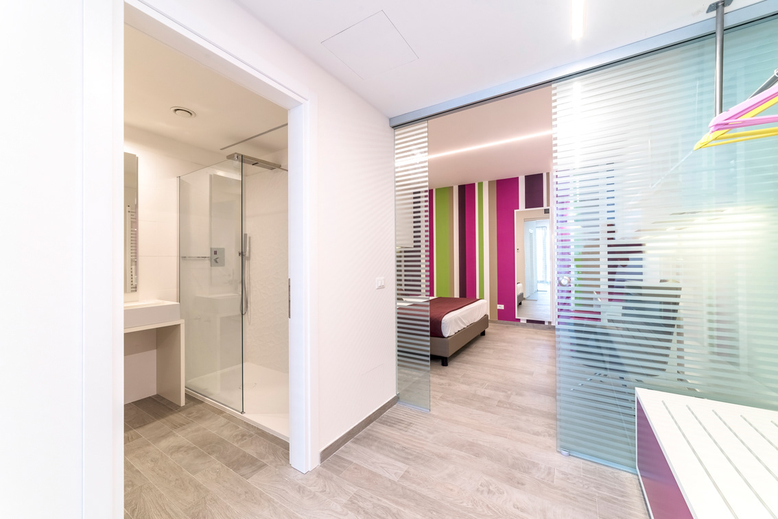

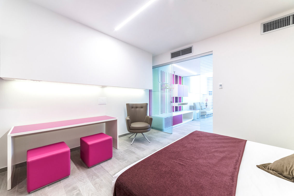
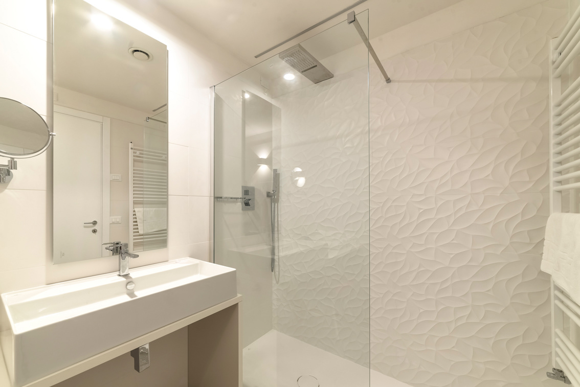
Hotel Tenda Rossa is a waterfront property on the Marina di Carrara coast with 70 years of experience in the tradition of hospitality. Throughout several phases it has been expanded and renovated to keep pace with the needs of customers who are ever more attentive to the quality of their accommodations. In this spirit the 2017 renovation, upgrade and expansion work has begun to give a face lift to the building and to house three new suites on the ground floor (sea side). The architectural design was awarded to architect Marco Andreoni while the interior design project was the work of architect Daniele Menichini. The new suites are characterized by one basic floor plan with variations, which sees the living area in direct communication with the outdoor area and a bedroom on the linear continuation of this space; between the two environments of the living area and the sleeping area is the hallway that serves to filter and separate, as well as accommodate the wardrobe area and entrance to the bathroom. The interior architecture is minimalist, characterized mainly by projecting volumes suspended over functional areas and cuts of LED lighting flush with the volumes themselves or the ceilings. The volumetric spatial organization, based on pure shapes, is therefore one of the inspirational elements of the project. Accordingly the furnishings are unpretentious, linear and integrated into the logic of geometry so that container and content speak the same language in a formal dialogue with each other. The space draws from the idea of “total white”, and is clearly influenced by another characterising element, also paradoxically divergent, i.e. the use of colour, again in geometric form. As a result, we have large vertical off-scale stripes behind the dressing area, at the end of the room, and on the soft curtains of the living area. The chromatic themes of the large geometric stripes are different for each of the suites, creating three different atmospheres with the same floor plan and volumes. In this sense, while white defines the spaces, and builds the volumes, colour gives each of the rooms a functional feel as a personality; the goal is to lead the viewers’ gaze through the arrangement of geometric elements and chromatically decorated surfaces to arrive at a positive mood and judgment. The importance of the contrast of shapes, lights, colours and materials is the basis of a dynamic and emotional fruition of the entire living space. It can be said that the inspirational theme is the seaside, a long stretch of beach lined with bathing establishments with colourful cabins, striped beach umbrellas and lounge chairs, in addition to the equally colourful beach towels that differentiate the areas of open beach. It is precisely this choice -- the beachscape theme - that informed the study of colours and combinations in sharp contrast with the clean lines of the interior spaces, giving that sense of warmth and hospitality expected from such accommodations. The geometry of the space, its furnishings and notable colour contrasts was a peculiar challenge requiring the definition of balance points in each of the rooms in sequence. In addition to choosing the theme, the functional elements of the project were made to merge to create continuity while breaking away from the reversionary play of contrasts whereby everything has an opposite, not absolute but in terms of comparisons. The result is an interdependence that precludes the existence of one without the other. White is given the leading role in the living area, interspersed with coloured resting surfaces in the furnishings and striped fabric upholstery; the space created by the natural light of the large window is very clean and technical with several functionalities hidden in the unusual sofa that becomes a bed. Then there is the completely concealed kitchenette area integrated in the scheme of simple volumes. The filter area between the two main environments consists of a system of crystal dividers that lets some light through its alternating opaque/transparent grooves, creating the effect “see/ don’t see” in the filter space. This space provides access to the bedroom and bathroom and also houses a wardrobe, comprising white and coloured volumes that stand out against the colour-striped wall. The bathroom is completely white in its furnishings, ceramics and complements; the wall covering is distinguished only on the wall of the large shower with a textured relief that concurs with the lights to create very interesting hues and shadows. Even in the bathroom, colour plays a key role; the shower area is fitted with a LED-strip handle with solid and variable light modes. Finally, the bedroom has more numerous coloured elements than the other rooms; this is where the large wall with coloured stripes − initially noticed upon entering the suite − is undoubtedly the dominant player in the suite itself and gives the feeling of depth. The plan was therefore to create a sort of gradual transition between the rooms, starting with the white elements and natural light of the entrance and ending with the colour of the end wall; in this shift from white to colour, the furniture and interior gradually become charged with geometric elements that always alternate the matrixes of white and colour. The suites are equipped with functionalities and systems curated in every minimum detail. These devices are needed to operate the facility and are fully integrated with the interior decor to minimize interference with the appearance of the environment, but at the same time they are essential to the comfort of the interior. The interior design was developed with the collaboration of 3d manager Giacomo Favilla in the design and presentation phase and with architect Angelo Lanzetta in the execution and implementation phase.